
- The standard hanging height is 145cm to centre of artwork — eye level for a standing adult — regardless of ceiling height.
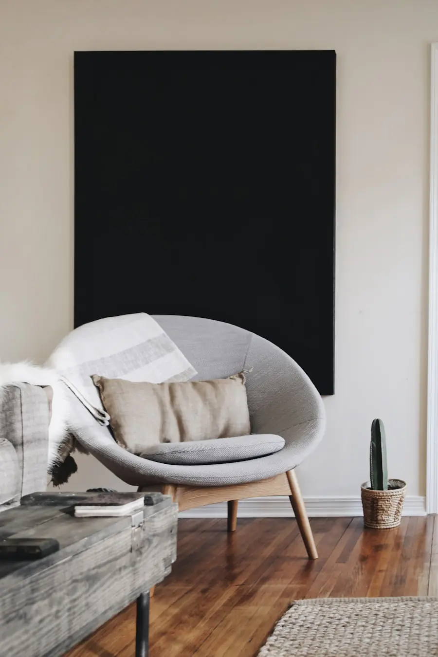
- Art hung above furniture should sit 15 to 25cm above the furniture’s top edge, never higher.
- A gallery wall works when pieces share a common element (frame colour, subject, palette) and maintain consistent 5 to 8cm gaps.
- Single large artwork outperforms multiple small works in most residential applications — scale reads as confidence.
- Plan gallery arrangements on the floor before making any wall fixings — rearranging on paper costs nothing.
Art hung incorrectly is one of the most common and most correctable interior design errors in residential spaces. The mistake takes a consistent form: artwork positioned too high, too small for the wall space it occupies, or grouped without a unifying visual principle. Each error is individually minor; collectively they produce a room that looks unfinished regardless of how well the furniture and colour palette are resolved.
Correct art hanging is a set of learnable rules, not an aesthetic talent. The rules address height, relationship to adjacent furniture, scale, and grouping — and they apply consistently across residential spaces regardless of style, period, or art collection.
The Standard Hanging Height: 145cm to Centre

Museums and commercial galleries hang art with the centre of the artwork at approximately 145cm from the floor — average eye level for a standing adult. This height is not arbitrary. It places the visual centre of the piece — the point the eye naturally seeks when approaching the work — at the most comfortable viewing angle without requiring the viewer to look up or down. It also creates a consistent visual horizon line across multiple works on the same wall, which produces the reading of an intentional arrangement rather than randomly positioned objects.
Most residential art is hung too high. The instinct to place art higher — “to fill the wall,” “to make the ceiling feel taller,” “to see it from across the room” — consistently produces a disconnected relationship between the artwork and the room. Art hung at 165cm or 175cm centre height reads as if it is floating above the room rather than inhabiting it. Lower the art to 145cm centre height and the room reads as designed.
The 145cm rule applies as the default for standalone works in areas used primarily standing. The exception is art above furniture — covered in the next section — and art in rooms used primarily seated, where a slight downward adjustment (to approximately 135cm centre height) is appropriate.
Art Above Furniture: The 15 to 25cm Rule
When art is hung above a piece of furniture — a sofa, a sideboard, a bed headboard, a console table — the standard 145cm centre rule is superseded by the furniture relationship rule: the bottom edge of the artwork should sit 15 to 25cm above the top edge of the furniture. This creates a visual connection between the artwork and the piece beneath it — they read as a composition rather than as unrelated objects sharing a wall.
At gaps greater than 25cm, the artwork floats above the furniture and the visual relationship is lost. At gaps less than 15cm, the artwork feels cramped against the furniture and the two elements compete rather than complement. The 15 to 25cm zone is where both elements are simultaneously readable as a grouped composition. Measure from the top of the furniture to the bottom of the frame before fixing — this is the measurement that determines placement, not the centre height.
Scale: When One Large Piece Outperforms Many Small Ones
A single large-format artwork typically outperforms a collection of smaller works in residential spaces for two reasons. First, scale communicates confidence — a piece large enough to command its wall reads as a deliberate statement; a small piece on a large wall reads as a placeholder or an afterthought. Second, a single large work requires no grouping decisions, no gap calibration, and no unifying principle beyond the work itself. It resolves the wall completely in one decision.
The scale test is simple: an artwork for a given wall should span at least 50% to 60% of the wall width it occupies, or at least 50% to 60% of the furniture width it hangs above. Below this threshold, the artwork reads as too small for its context. Above it — up to the full furniture width — it reads as appropriately commanding. This rule explains why a 60cm by 80cm print above a 220cm sofa consistently looks inadequate: the print spans approximately 27% of the sofa width. The same print above a 90cm console table spans 67% of the width and reads correctly.
Gallery Walls: The Planning Process

A gallery wall works when pieces share a unifying element and maintain consistent gap distances. The unifying element can be frame colour (all black, all natural wood, all white), subject matter (all botanical, all architectural, all family photographs), or colour palette (all works drawn from the room’s accent colour). A gallery wall without a unifying element reads as a collection of unrelated objects rather than a curated arrangement.
The planning process is non-negotiable: lay all pieces on the floor in the proposed arrangement before making any wall fixings. Photograph the floor arrangement, then stand back and evaluate it as if looking at a wall. Adjust gaps, swap positions, and vary the arrangement until the floor composition reads as balanced and intentional. Consistent gaps of 5 to 8cm between all pieces produce the tightest and most graphic reading — the arrangement reads as a single composite object. Gaps of 10 to 15cm produce a more relaxed arrangement where each piece reads more independently. Inconsistent gaps produce the visual disorder that characterises most gallery wall installations that do not work.
Transfer the floor arrangement to the wall using paper templates: trace each frame onto paper, cut out the shapes, and arrange the paper templates on the wall using low-tack tape. This allows final adjustment before any nail or fixing is placed. The cost of this process is 30 minutes; the alternative — drilling based on estimation and adjusting repeatedly — typically takes longer and produces visible multiple fixing holes that require filling.
Practical Fixing Notes
Every artwork on a wall should be hanging level. A small spirit level held against the top edge of the frame after hanging confirms this in three seconds. Most picture wire systems allow lateral adjustment by sliding the wire across the hook — use this to centre the piece precisely after hanging. For heavier works (over 3kg), use two fixing points rather than one to prevent the frame from swinging out of level over time under its own weight. For works over 10kg, always fix to a wall stud or use a load-rated wall anchor — picture hooks rated only for plasterboard are not appropriate for significant weights. For the full wall storage and display system that integrates art hanging with shelving and organisational decisions, our floating shelves installation guide covers wall fixing principles in detail.
Mixing Frame Styles and Digital Art
A gallery wall with mixed frame styles — some timber, some black, some white, some ornate — typically reads as disordered unless the mixing is deliberate and consistent. The most reliable approach is a single frame finish across all pieces in a grouping: all black, all natural oak, all white, all antique gilt. Within a consistent frame finish, variation in frame width (thin profile versus wide profile) adds visual interest without producing the conflict that finish variation creates.
The alternative — mixing two frame finishes deliberately, with each finish used multiple times so the mixing reads as a decision rather than an accident — works in some contexts. All-black and all-natural-timber as a two-finish system can produce a warm, considered gallery wall. The key is that each finish appears at least three times in the arrangement, so that no single frame reads as an outlier. A single frame in a different finish from all others reads as a mistake, not a choice.
Digital art displays and LED art frames have become a practical option for rotating art collections in residential spaces. If used, they benefit from the same scale and height rules as physical frames — and from consistent framing (a single device or a single style of frame around multiple screens) rather than an assortment of different device sizes and finishes. The technology is invisible when the display is well-considered; it draws attention when it is not.


The 145cm centre height rule changed every room in my flat. I had been hanging at whatever felt natural, which turned out to be consistently at 165-170cm centre. Rehung everything at 145cm. The rooms read completely differently — the art inhabits the room now rather than floating above it. One afternoon of work, permanent result.
The scale test for art above furniture is the calculation I had been doing intuitively and getting wrong. I measured my sofa (220cm) against the print above it (55cm wide) — 25% of sofa width. Replaced with a 140cm wide canvas. The difference is not subtle. The sofa and artwork now read as a composition; previously the print just happened to be on the wall above the sofa.
Floor planning with paper templates before making any fixings is the advice that saves the most time and plaster damage. I have done gallery walls both ways. Without planning: two hours of trial holes and filling. With paper templates: 30 minutes of planning on the floor, 20 minutes of drilling. The result from the template method is also measurably better because every gap can be calibrated exactly before committing to a single hole.
Astrid — the template method is standard practice in professional installation for exactly the reasons you describe. The planning time is not overhead; it is the work. Every decision made on the floor is a decision that does not need to be made at height with a drill in hand.