
- Floor area perception is determined by what is visible on the floor, not the room’s actual square footage.
- Floating furniture — pieces positioned away from walls — makes a small room feel larger, not smaller.
- Vertical surfaces are the most underused storage resource in constrained living rooms.
- A single focal point anchors the layout and prevents the visual fragmentation that shrinks a room.
- Multifunctional furniture earns its floor space by performing two or more roles simultaneously.
Small living rooms are not solved by removing furniture. They are solved by placing it correctly. The perception of space in a room is governed primarily by three visual variables: floor continuity (how much unobstructed floor is visible), sightline length (the distance from the entry point to the farthest visible surface), and vertical emphasis (whether the eye is drawn upward toward the ceiling or held at a low, crowded horizontal plane). Manipulating these three variables through deliberate furniture placement and storage design produces a room that reads as significantly larger than its actual square footage.
This guide covers the layout principles, furniture selection criteria, and storage strategies that deliver the largest perceptual and functional gain in living rooms under approximately 25 square meters.
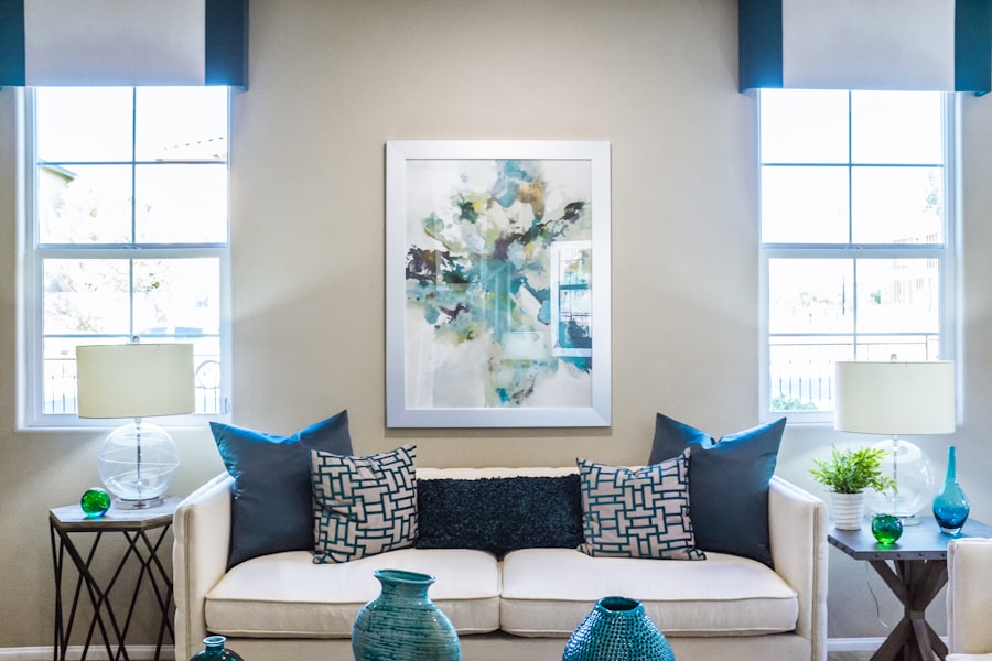
The Floating Furniture Principle
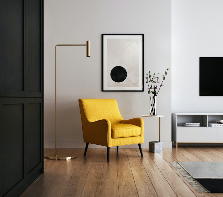
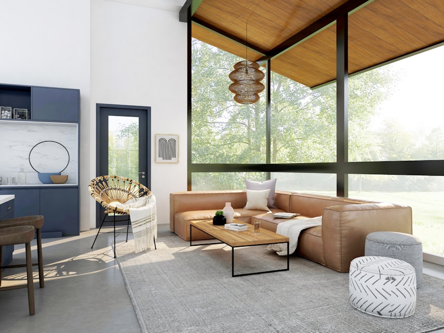
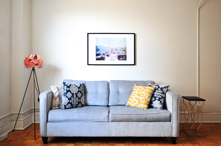
The instinct in a small room is to push furniture against the walls to maximise floor area at the center. This instinct is consistently wrong. Furniture pushed to the walls flattens the room visually, eliminating depth perception and making the space read as a single cramped plane. Floating furniture — pieces positioned 20 to 40 centimeters from the walls — creates a visible perimeter gap that signals depth, separates the furniture plane from the wall plane, and makes the room feel wider.
The floating principle applies primarily to the sofa and the primary seating group. Position the sofa with its back at least 30 centimeters from the wall behind it. If the room is too small to accommodate this without blocking circulation, position the sofa perpendicular to the main wall rather than parallel to it — this opens the primary sightline from the entry point to the farthest wall, which is the spatial experience that most determines whether a room feels large or compressed.
Coffee tables should be low-profile — under 45 centimeters in height — and positioned to allow clear floor visibility around all sides. Glass-topped or open-frame coffee tables have a lower visual mass than solid-topped versions and are consistently the better choice in constrained rooms.
Establishing a Single Focal Point
Visual fragmentation — multiple competing focal points of similar visual weight distributed across the room — is the primary cause of a small living room feeling chaotic and smaller than it is. A room with a gallery wall on one side, a large plant in a corner, a bold rug, and a decorative media console is making four simultaneous claims on the eye. The eye cannot settle, the room reads as crowded, and the perception of space shrinks.
Designate one wall or one zone as the room’s single focal point: the media wall, a large-format artwork, a fireplace, or a built-in shelving unit. Anchor the primary seating group toward this focal point and keep all other surfaces deliberately minimal. The focal point earns visual complexity; all other surfaces defer to it. This compositional principle is borrowed directly from professional interior photography — rooms that photograph well in constrained spaces are invariably organized around a single dominant visual element.
Vertical Storage: The Underused Dimension
Most living room storage occupies the horizontal plane — credenzas, low shelving units, storage ottomans — and competes directly with circulation and floor area. Vertical storage shifts capacity to the wall height above eye level, where it contributes storage without reducing floor continuity or sightline length.
Floor-to-ceiling shelving on a single wall is the highest-density storage option for a small living room. It increases storage capacity by a factor of three to four compared to a standard-height unit of the same width, draws the eye upward (making the ceiling feel higher), and concentrates all storage on a single surface — preserving all other wall surfaces for their spatial role. The shelving should be recessed or flush with the wall plane where possible; protruding units reduce the room’s depth perception.
For DIY floating shelf installation that achieves a recessed look at lower cost, our floating shelves installation guide covers the full build and fixing process. For furniture that combines seating with vertical storage, our multifunctional furniture review covers the specific pieces that perform best in constrained living rooms.
Multifunctional Furniture: Earning the Floor Space
Every piece of furniture in a small living room should perform at least two roles. A piece that performs only one role — a decorative side table, an armchair used rarely, a standalone bookshelf of limited capacity — is a poor allocation of the room’s scarce floor area. The evaluation question for any furniture in a constrained space is: what is the ratio of utility delivered to floor area consumed?
The storage ottoman is the canonical example: coffee table, additional seating, and hidden storage in a single piece. Sofa beds convert a single-function seating piece into a guest sleeping option. Media units with deep closed-door storage below and display shelving above serve both containment and aesthetic functions. Nesting tables provide occasional surface area that stacks to near-zero footprint when not in use.
Conversely, chairs that serve primarily a decorative role, rugs that are oversized for the furniture grouping, and large floor plants positioned in sightline-critical corners all occupy floor area at a high cost-to-utility ratio and should be evaluated for replacement or removal. For complete storage strategies specific to living room constraints, our vertical storage hacks guide covers the full range of solutions for rooms under 500 square feet.
Light, Color, and the Perception of Space
Spatial perception is not determined solely by furniture placement. Light and surface color alter the perceived dimensions of a room significantly. Pale walls — off-white, warm cream, light greige — reflect light back into the room and push the apparent wall plane outward. Dark walls absorb light and bring the visual boundary inward. In a constrained room, this effect is amplified: the difference between a dark-painted wall and a pale-painted wall can produce a perceived size difference equivalent to several square meters.
Window treatment is equally significant. Curtains hung close to the window frame and stopping at sill height shrink the window visually and reduce light. Curtains hung at ceiling height and extending 15 to 20 centimeters beyond the window frame on each side make the window appear larger, allow full light penetration when open, and draw the eye upward. This single change is among the highest-impact, lowest-cost interventions available in a small living room. Use sheer fabrics rather than heavy curtains wherever privacy requirements permit — the diffused light effect is more spacious than blocked light with occasional direct shafts.
Mirrors placed on the wall opposite a window double the visible depth of the room and reflect natural light across surfaces that would otherwise be in shadow. A single large-format mirror is more effective than multiple small mirrors, which produce visual fragmentation rather than depth extension.
Layout Sequence: How to Start
Approach the layout process in this sequence: first, identify and confirm the single focal point. Second, position the primary seating group in relationship to that focal point, with furniture floated from the walls. Third, identify the circulation path through the room — the route from the entry to the main exit — and ensure it is unobstructed at a minimum width of 80 centimeters. Fourth, evaluate every remaining piece of furniture against the floor-area-to-utility ratio criterion and remove or replace pieces that fail it. Fifth, address vertical storage on the wall or walls that are not occupied by the focal point.
This sequence consistently produces a room that is better organized, more visually spacious, and more functionally efficient than the same room rearranged by instinct. The instinct to fill space produces crowded rooms. The discipline to subtract produces spacious ones.
Common Mistakes That Make Small Rooms Smaller
Three mistakes account for most of the small-room design failures that a layout rethink can correct. The first is the oversized rug: a rug that extends to the walls or beneath all the furniture legs anchors every piece in place and prevents the floating arrangement that creates depth perception. A rug in a small living room should be sized to sit under the front legs of the sofa and chairs only — the rear legs float off it — or smaller. The second mistake is the undersized artwork: a single small framed print on a large wall draws attention to the wall’s emptiness rather than creating visual interest. A single large-format piece, or a tightly grouped arrangement spanning at least 70% of the wall it occupies, fills the wall appropriately and prevents the scattered-small-object effect. The third is the inconsistent storage height: mixing tall units with short units with medium units on the same wall creates a jagged vertical profile that reads as disorder. Standardizing storage height — all units the same height, or all units floor-to-ceiling — produces the visual calm that makes small rooms feel controlled rather than chaotic.
The floating furniture principle was counterintuitive to me — I had pushed everything against walls for years. Moved the sofa 35cm from the wall two weeks ago. The room genuinely looks larger. It took about six hours to convince myself to try it and thirty seconds to see it was right.
The curtain height point is something I share with every client: hanging curtains at ceiling height with extra lateral width is the highest-impact cheapest intervention in any room. Cost of new curtain rod and fabric: under €80. Perceived effect: two extra square meters of window and 30cm of extra ceiling height.
The single focal point principle solved a problem I couldn’t name. My previous living room had four things competing for attention at once and felt chaotic regardless of how clean it was. Consolidated everything to one media wall, neutralised all other surfaces. The room is the same size. It feels completely different.